Mapping Pictish stones with Google My Maps
In which I learn—and share—an easy way to use spatial data for historical research
I’m fizzing with excitement this week, as I’ve been on a two-day course at the Institute of Historical Research to learn how to use geographical data for, well, historical research.
It’s opened my eyes to the potential of spatial data to reveal patterns that can contribute to our knowledge of past societies. Led by Dr Justin Colson, the course taught some simple ways to make use of geographical data using Google My Maps, and then went into some much more complex uses of it using QGIS.
In this blog I’m going to show what’s possible with Google My Maps, which is pretty easy to use and surprisingly powerful for some types of data visualisation.
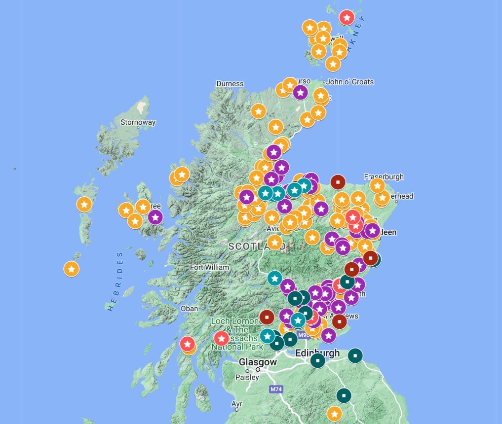
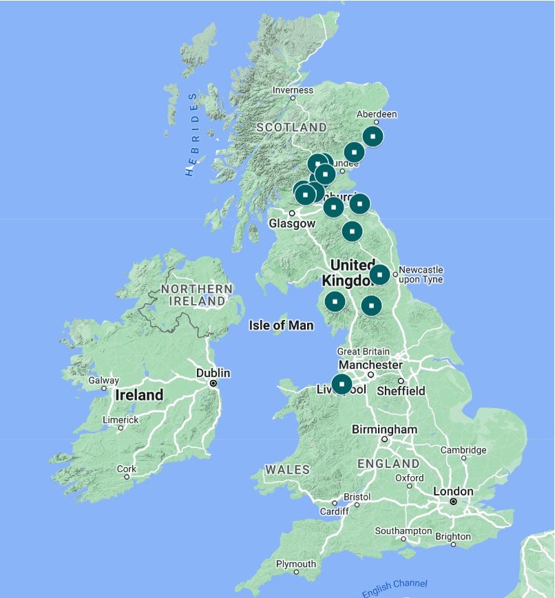
To show you what I’m talking about, here below is the map I was able to make as a result of the course – showing locations of Pictish stones and some place-names mentioned in the early documentary sources for Scottish history.
This is just a screenshot as the map won’t embed in Substack (booo), but click here to open the map and play with it.
Finding the data to make a historical map
This map actually started life as an Excel spreadsheet in Easter 2021, which is when I first decided I wanted to research early medieval Scotland.
I didn’t know then that I would end up applying to do a History MA; I just wanted to think more deeply about Pictish sculptured stones.
I’d watched an online talk from the 2021 Picts in the North conference by Hugh Levey, who has tried to uncover the ‘grammar’ of Pictish symbols using an MS Access relational database. I didn’t know how to use MS Access (still don’t, really) but I thought that if I could get a load of data about the stones into Excel, I could also start to look for interesting patterns.
In particular, I wondered how the distribution of the stones might relate to other features in the landscape, like rivers and lochs, burials, prehistoric monuments, and places with Pictish place-names.
I wasn’t sure if it was actually possible to analyse that kind of thing in Excel (spoiler: it isn’t). But I figured a spreadsheet of data would be a useful thing to have anyway, so I set about making one.
But where could I find reliable data about the original location of every Pictish stone? The answer is in Historic Environment Scotland’s Canmore database – a huge online repository of information relating to historical sites and finds across Scotland.
I searched for “symbol stone”—there are about 250-odd—and started manually entering what I considered to be useful info in my spreadsheet.
Here, for example, is the headline data for Rodney’s Stone at Brodie Castle:
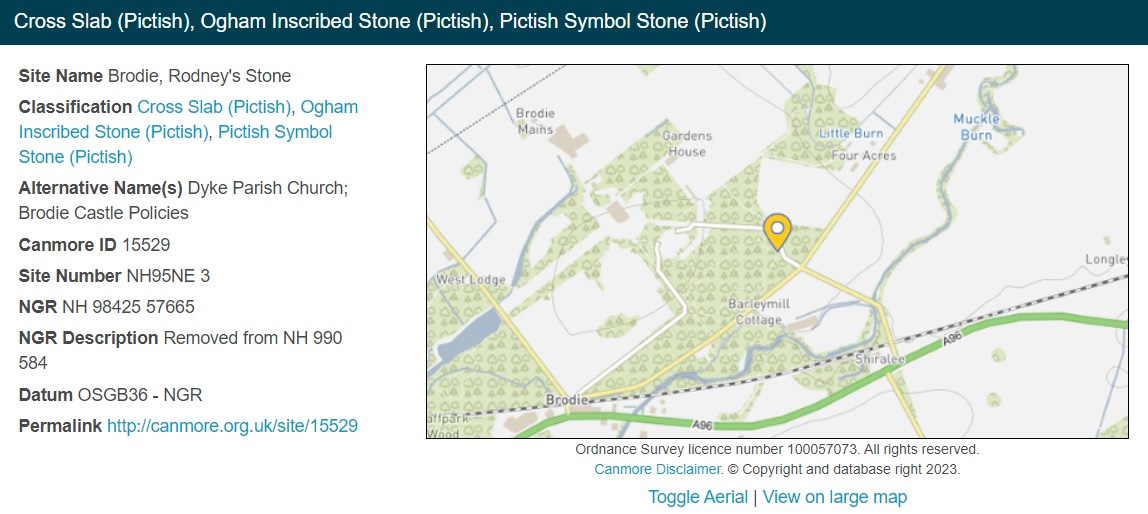
As I wanted to look at the landscape context of each stone, the most important thing for me was the National Grid Reference (NGR) of the stone’s original location, or as near as I could get to it.
Canmore is pretty good at providing info on the original or earliest recorded location. As you can see in the screenshot above, it includes NGRs for where the stone is now (in the driveway of Brodie Castle) and where it was before it was moved (in the kirkyard at Dyke).
I entered the earliest known NGR for each stone into my spreadsheet, along with other info, including interesting nearby features and place-names that I could see on the map.
I also recorded quite a lot of information about the symbols on each stone, including which symbols were present, and whether they were noticeably being used to ‘label’ figures carved on the stone. And I also noted whether there was an ogham inscription on the stone, and if so, what it reads.
A lull in the proceedings
And then… I left it. I didn’t know how to analyse the data, and by the time I ended up applying for my MA I’d become more interested in the later, post-Pictish period of the ninth to eleventh centuries – the time of the Alpinid dynasty and the Gaelic kingdom of Alba.
So the spreadsheet gathered virtual dust—until recently, when I started thinking about the early documentary sources for Scotland in the time of the Alpinid dynasty.
The text of one manuscript, the Chronicle of the Kings of Alba, is generally agreed to date from the late tenth century, and is therefore the earliest surviving native documentary source for eastern Scotland. It mentions quite a lot of place-names, including the ambiguous ‘Sraith Herenn’ that I’ve explored in previous blog posts. Would mapping these place-names reveal anything useful?
I didn’t know how I would even begin to do that, so I looked for a training course on using spatial data for historical research, and found this one by the IHR. It seemed to have everything I was looking for, so I booked on to it and attended on Monday and Tuesday this week.
What I learned just on Day 1 enabled me to take my original Pictish stones spreadsheet, plus another one I made of place-names mentioned in the early sources, and make the map I shared above, which I think is pretty stunning.
How to map historical data in Google My Maps
The map is made with Google My Maps, which you may have used before, but you may not be aware of what it’s capable of (I certainly wasn’t).
For those interested, here’s a basic tutorial:
Step 1: Make your spreadsheet
Put all your info into columns and give them appropriate headers. As we’ll see in a bit, Google My Maps will look at the column headers to see which ones it thinks will be most useful for locating the places on the map.
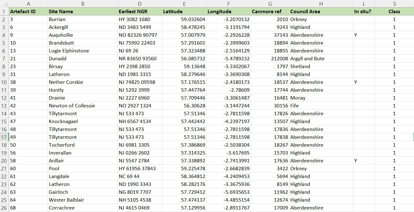
For the stones, I’ve put the latitude and longitude co-ordinates (in columns E and F) of each stone’s original location or findspot. Finding these was by far the most technical thing I had to do. Canmore doesn’t give co-ordinates, only national grid references, so I had to convert the NGRs into latitude and longitude (X and Y) values. I found two websites where I could do that:
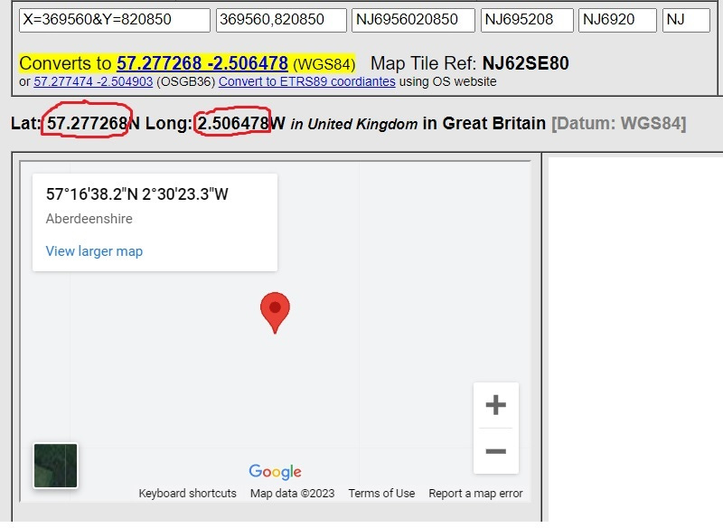
Nearby.org.uk has a converter for individual NGRs. Type in an NGR and scroll down, and you get the co-ordinates that I’ve circled in red below. This is what you put under the relevant headers in your spreadsheet. Note: I had to make the longitude figure a minus figure in the spreadsheet for it to work.
UK Grid Reference Finder has a tool for batch-converting multiple NGRs to lat/long. I just pasted my whole column of NGRs into the converter, and it spat out all of the lat/long co-ordinates, which I pasted back into the relevant columns in Excel. This whole process took less than a minute.
Step 2: Create new map
Go to Google My Maps and click on Create New Map in the top left-hand corner. That brings up this screen, which is where you’ll import your spreadsheet.
Step 3: Import your data
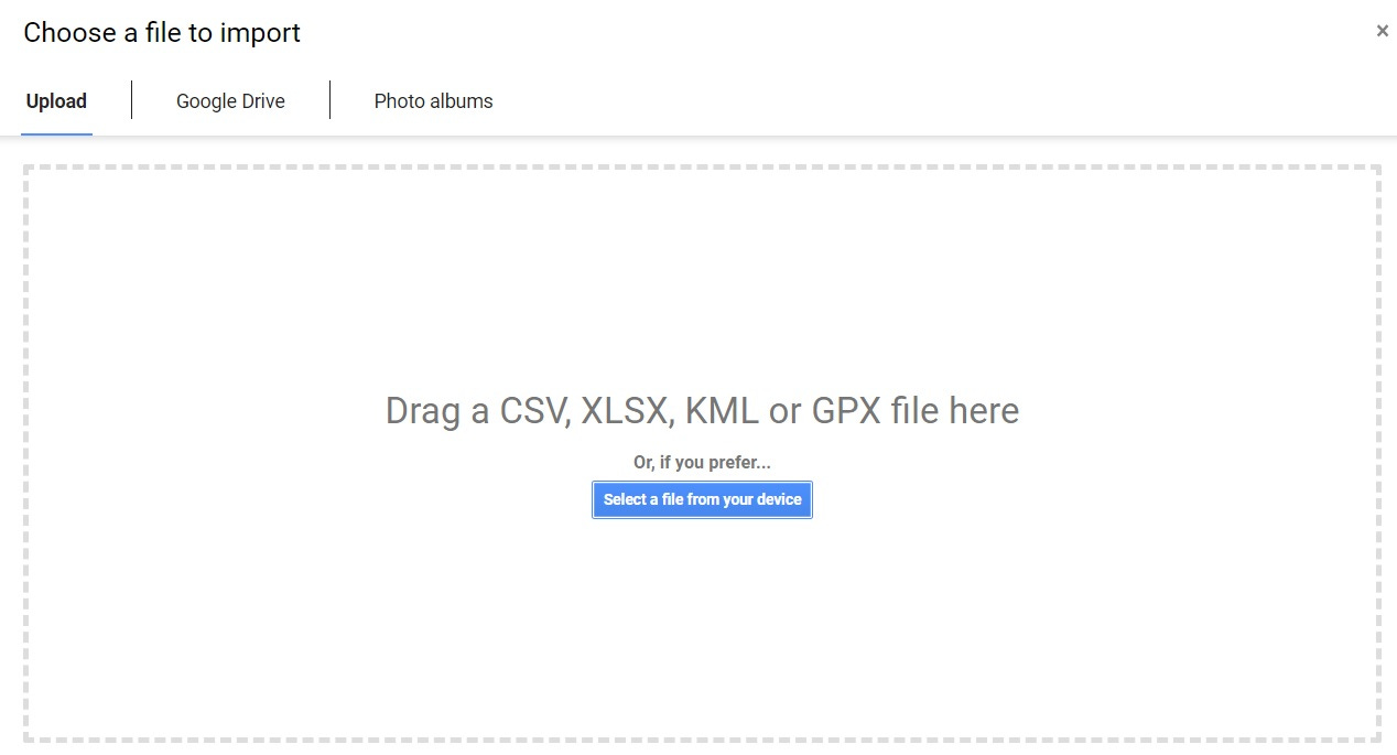
Click on the ‘Import’ text under ‘Untitled Layer’ and you’ll get this screen:
You can click or drag your spreadsheet into this box, or click on the blue button to browse for it on your device.
Step 4: Select your positioning data
Google My Maps will look at your column headers to find ones it thinks will help it place your data on to the map. In my case, it’s seen I’ve got headers called Latitude and Longitude, so it pre-selects them to suggest I use those:
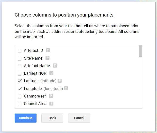
You don’t have to use latitude and longitude for this. You could use town name + country, or anything Google Maps is likely to recognise as a specific place. Just remember to make a separate column for each element. In my case, the stones are (or were) in such specific places that only lat/long can really pinpoint them.
Step 5: Select the field you want to use to title each marker
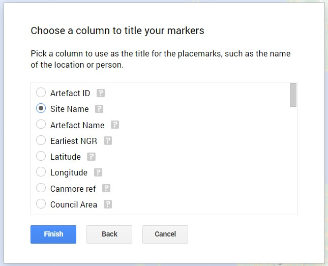
This is the title that will come up when someone clicks on a marker. I’ve chosen ‘Site Name’ for mine.
Click on ‘Finish’ and after a little bit of uploading time, you should see your data mapped!
There’s lots of other stuff you can do as well – if you want to be able to filter the data on the map, you could separate it out into different layers, with a different spreadsheet for each layer. I’ve got seven different layers on mine, each with its own spreadsheet, so I can turn elements on and off.
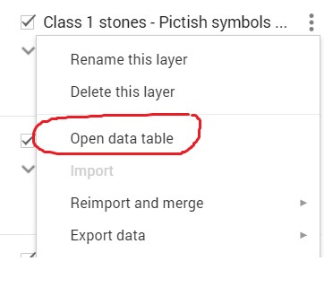
You can also style the markers by clicking on the paint roller and paint tin icons in the map editor. And you can open up and edit your spreadsheet directly in the map by clicking on ‘open data table’ from the three-dot dropdown next to your layer:
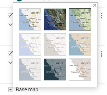
…and you can choose the style of the underlying map by clicking on ‘base map’ at the bottom of the editing panel. I chose ‘terrain’ (top right) to get rid of most of the modern elements, and to make it easier to see what kind of terrain the Picts were occupying.
What can I do with this data, though?
I’m beyond thrilled with what I’ve been able to do just with these fairly basic tools. But as I learned on the course this week, while Google My Maps is great for making nice interactive maps to share with other people, it’s not great for really digging into the data and analysing it.
When I first made this map, my plan was to look at how places with a Pictish presence (indicated by the existence of Class 1 or Class 2 symbol stones) line up against places mentioned in the historical sources for the later Kingdom of Alba. Were the kings of Alba active in the same places as had been important in Pictish times, or were they active in different places?
I can scratch the surface of that question. My map shows, for example, that the Chronicle of the Kings of Alba never mentions any specific place north of Stonehaven (Dunnottar), despite the fact that (at least) two kings of Alba met their deaths on the Moray Firth coast, at Cullen and Forres. Its focus is mostly southward of its production centre, thought to have been the scriptorium at Dunkeld.
But if I want to dig deeper – to add more manuscript sources, or to look at places associated with each of the kings of Alba, or to try to plot journeys taken by those kings, or incursion routes taken by Scandinavian or English attackers, I need a more powerful piece of software.
That’s where the second day of the course came in—where we learned how to import and analyse geospatial datasets in a full-blown Geographical Information System (GIS). But that’s a whole different dimension of complexity, and not something to go into in this blog.
So many possibilities…
What I will say, though, is that mapping and geospatial tools have a huge amount of potential for historical research, and these tools are well within reach of historians who don’t have a technical background.
As I said at the start, I’m now fizzing with ideas for how I could use GIS software to research early medieval Moray—although we were warned about the risk of falling down rabbit-holes: just because you can map and analyse something, it doesn’t mean it will be a good use of your time!
For now, I hope you enjoy having a play around with the Pictish stones and early place-names map above. If you have any questions, or if it inspires you to have a go at mapping something yourself, it would be great to hear about it in the comments.


There used to be a feature of Canmore called Canmap which presented all of the historical records in a GIS. You could zoom on an area and see everything (buildings, find spots of artefacts etc). It was great.
I believe they lost the funding for the GIS package some (many?) years ago. Good GIS software is not cheap or certainly wasn’t back in the day and OS charges for the map data were also expensive. But nowadays there are some good open source GIS and maps.
Canmap was produced by RCAHMS themselves. Maybe HES could step up to the mark and redevelop it with open source minimising the costs that doomed Canmap
This is such a great walk through of how much is accessible across the world for analysing data sets like this, and the information to be gleaned from them. Many years ago in my own m.phil days I worked with CANMORE and their team to help map class I symbol stones and Pictish-age/early medieval broch sites, and it was long enough ago (sheepishly enough) that there was nothing like this available outside specific research databases and GIS teams. So exciting to see this work and what's possible. Thanks so much for sharing.